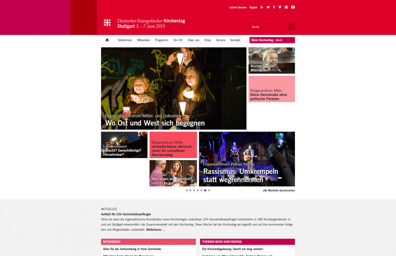
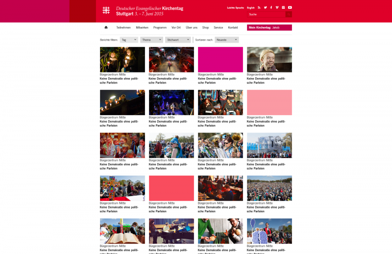
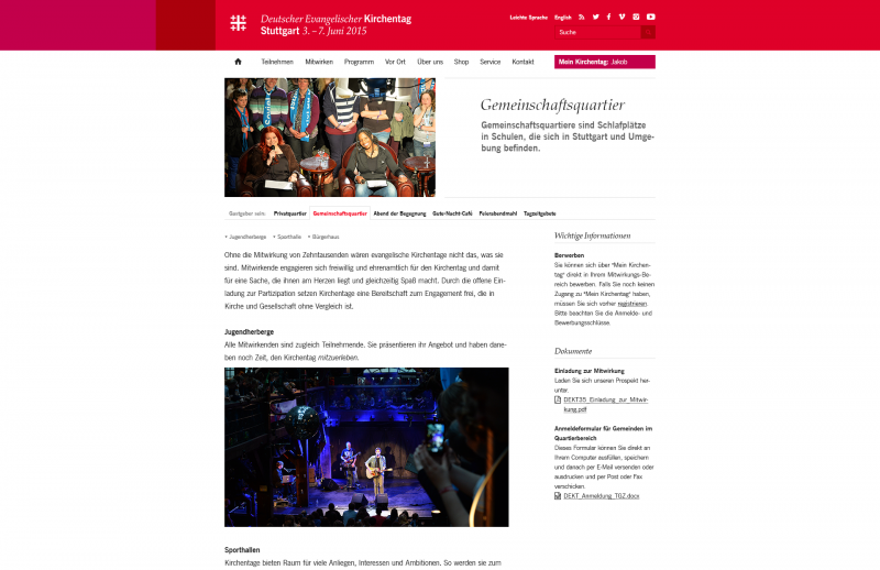
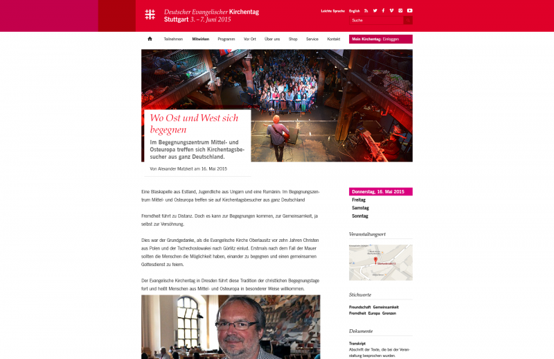
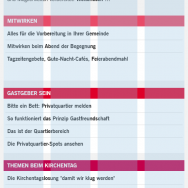
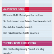
The Deutscher Evangelischer Kirchentag is a mega event, which needs a lot of planning beforehand. For the event, which took place in Stuttgart this summer, the website experienced a radical redesign: the aim was to create a modern and user friendly website. Our main goal was, to create a more intuitive and clear structure for the extensive content presented on the website, so that the user is able to quickly find the relevant information. This was possible by closely working with the client and shaping the information architecture together depending on the multiple interest groups.

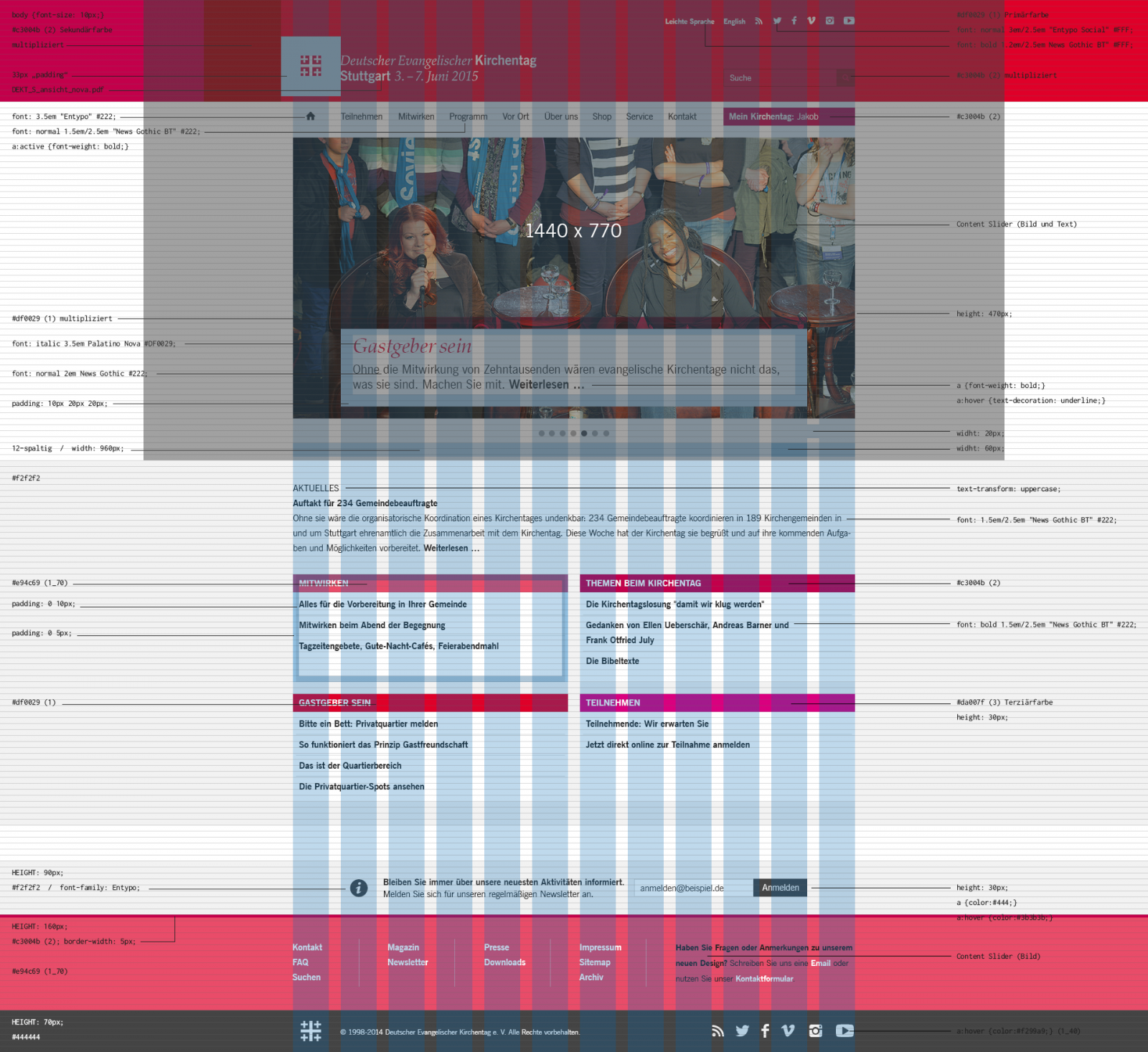


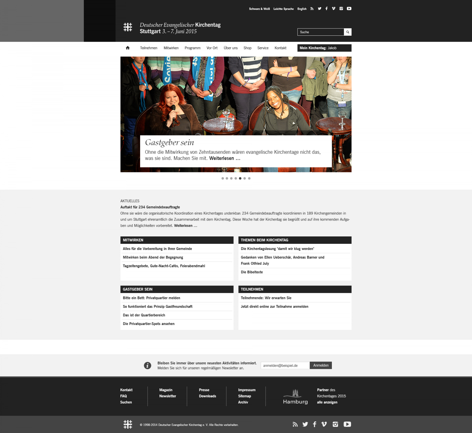
Furthermore, the website is accessible for visually and mentally handicapped people thanks to the language selection »simple language« and precisely adjusted colors and contrasts.

After each Kirchentag the website changes colors corresponding with the next color code acording to thecorporate design guidelines. Hence, the visitor can instantly see the end of this years Kirchentag but also the start of the next one to come.
The Kirchentag online
Visit the Kirchentag online.
Credits
— Romina Maidel (Romina-Maidel.de)
— Saltation (implementation)